Welcome, fellow ITESM student!
While doing my MBA at the ITESM (that’s “Instituto Tecnológico y de Estudios Superiores de Monterrey”, Tec de Monterrey, or MIT for spanish-impaired visitors) I had a hard time finding clean, good-resolution, usable logos for presentations and written reports. In time, I have compiled different versions of artwork related to my alma mater, and you will find them here in no particular order.
I hope you find this artwork useful in your own coursework. If you do, please let me know.
| The “Borregos Tec” logo. Briefly spotted as a bumper sticker, turned out to be a thing! I found an official-looking version on Google Images and traced it by hand to generate these raster and vector versions. | |
|
Borregos Tec, raster and vector artwork, black and blue, transparent background.
|
|
|
Borregos Tec, raster and vector artwork, gray and white, transparent background.
|
|
 |
The redesigned logo, announced on August 2014. For all practical purpose it’s the current “Tec de Monterrey logo”. Since I couldn’t find a vector file I took a small SVG from the webpage, then rasterized and optimized these PNGs. The EPS and SVG versions have been scaled to a reasonable default size. |
 |
New “Tecnológico de Monterrey” Logo (2014), raster and vector artwork, blue.
Colorized version of the files below. |
 |
New “Tecnológico de Monterrey” Logo (2014), raster and vector artwork, grayscale, for print.
|
 |
New “Tecnológico de Monterrey” Logo (2014), raster and vector artwork, inverted, for enhanced contrast against colored backgrounds.
|
 |
Logo for “Prepa Tec”, a separate branding effort for ITESM’s High School. This version has been shamelessly ripped off a promotional PDF. |
 |
Prepa Tec Logo, raster and vector artwork, blue.
This is the most common combination I have seen, a blue isotype with black letters, but you will find a couple of variations below. |
 |
Prepa Tec, raster and vector artwork, grayscale, for print.
|
 |
Prepa Tec, raster and vector artwork, inverted, for enhanced contrast against color backgrounds.
|
 |
Logo for “Prepa Tec” in a vertical layout. |
 |
Prepa Tec Vertical Logo, raster and vector artwork, blue.
|
 |
Prepa Tec Vertical Logo, raster and vector artwork, grayscale, for print.
|
 |
Prepa Tec Vertical Logo, raster and vector artwork, inverted, for enhanced contrast against color backgrounds.
|
| The EXATEC logo, also known as EX-A-TEC. This is a recent redesign that deviates from the old duotone symbol (that I never traced). | |
|
EXATEC logo, raster and vector artwork, blue.
|
|
|
EXATEC logo, raster and vector artwork, grayscale, for print.
|
|
|
EXATEC logo, raster and vector artwork, inverted, for enhanced contrast against color backgrounds.
|
|
 |
Isotype for the redesigned logo, isolated for social media or as a base for other applications like PrepaTec above. |
 |
“Tec de Monterrey” Symbol (2014), raster and vector artwork, blue.
Colorized version of the files below. |
 |
“Tec de Monterrey” Symbol (2014), raster and vector artwork, grayscale, for print.
|
 |
“Tec de Monterrey” Symbol (2014), raster and vector artwork, inverted, for enhanced contrast against color backgrounds.
|
 |
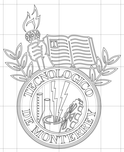
Standalone seal, circa 2000, reserved for official purposes. I extracted the seal from John Dauphinais’s version below. |
 |
“Tecnológico de Monterrey” seal, raster and vector artwork, blue.
|
 |
“Tecnológico de Monterrey” seal, raster and vector artwork, grayscale, for print.
|
| John Dauphinais did an excellent work tracing this version by hand, and he kindly shared his hard work with everyone else. | |
 |
“Tecnológico de Monterrey” Logo, raster and vector artwork
|
| This next logo comes from the page of CARE at the Monterrey Campus. I was not able to find vector artwork for this logo and I just was not able to identify the typeface in it — my best guess was that the typeface is a manually tweaked variant of Dialog Semi-Bold, but I’ve also been told that someone built it from scratch. Happily, this is a moot point now because John Dauphinais traced the new version above. I’ll leave this version around for a while for archaeological purposes but you’d be better off using his. | |
 |
Tecnológico de Monterrey” Logo, raster-only version
|
| This next version of the “Tec de Monterrey” logo has been deprecated. Repeatedly. In favor of the versions above. | |
 |
“Tec de Monterrey” Logo
|
| I believe this legacy ITESM seal came from a marketing PDF somewhere on the net, which I managed to find and clean up for the umptenth time ’til I finally had the good sense to archive it for later use. I used this to build the Tec de Monterrey logo immediately above. | |
|
ITESM Seal, circa 1980.
|
Usage guide
In the past ITESM published some basic guidelines for the use of the logo as a PDF document (edit: dead link as of 20110919, local copy here). One of the most notable changes is that the “Tec de Monterrey” logo has been officially discontinued in favor of the “Tecnológico de Monterrey” logo as mentioned above.
More recently, Raul reports that ITESM has published an online policy guide for usage of logos and trademarks including a rather impressive array of guides in PDF form (sorry, links broken as of 20190324. I’ll post a local copy if I ever lay my hands on one).
Colors
Extraoficially, I understand that the official color, known as “Azul Tec” or “Azul Reflex”, is actually PMS Reflex Blue:
CMYK: 100C 90M 30Y 8K
RGB: 0R 32G 159B
RGBHEX: #003399
Edit 20110919: According to the aforementioned policy
guide, the institutional color is actually PMS 281.
CMYK: 100C 72M 0Y 32K
RGB: 0R 40G 104B
RGBHEX: #003366
Edit 20170328: I can’t find any official sources, all authoritative links appear to be dead, but starting in 2014 the logo bears a slightly brighter shade of blue:
RGB: 0R 51G 160B (sic)
RGBHEX: #0033A0
Bonus
Rubén Moreno has compiled a comprehensive summary of the visual identity of the Tec de Monterrey. Check it out! (Now archived at the Internet Archive).